Monday 30 July 2007

Abel and Cole

I came across this pamphlet the other day in an organic food shop and was really bowled over not only by the design of the pamphlet, but also by the thinking and the idea behind the service.

Keith Abel and Paul Cole started delivering potatoes from a basement in Catford back in 1988. A couple of years later they heard about organic growing and were inspired by the idea of fresh, healthy produce grown in a sustainable, responsible way.

So in 1993, Abel & Cole went organic and they haven’t looked back; Paul now works on organic wholesaling while Keith looks after the home delivery service. Abel & Cole are now based in Brixton and have a team of eight people putting the boxes together and eight drivers out on the road making deliveries. They say that they 'work hard to finish what the farmer started’ in every area of our business, from recycling paper and cardboard, to never air freighting produce, to using LPG vans.


As i saw it, this idea was one that was destined for good things. In our health conscious and seemingly organically obsessed world, this service would flourish very well, given the help of some good promotion and effective and well communicated branding. Whatever these guys were going to produce, there had to be a strong sense of purity, nature and an organic feel behing the visual material and their brand.

In short i think Laura Fearnside, (the designer) did a very good job. Firstly the use of colour that she employs, really reflects the earthy and natural feel that simply have to be communicated right from the the start. They colours aren't too bright or attention grabbing but just sit right together compliment each other and suggest an innocent but firm tone.

The logo is very well formed, as it sits naturally, unrestricted and symmetrically and doesn't feel as though it is forced or manufactured in any way, and i think that the simple line drawing of the tree echoes this and strengthens the brands essence. The use of the very organic, flowing and curvaceous typeface again only reiterates this sense of purity and helps keep all the design elements in harmony.


In the centre fold of the pamphlet is a very simple step by step guide, which takes you by the hand and walks you through the process of choosing you organic goods. This use of a basic flow diagram with the simple imagery and fun, but easy-to-understand language makes the process stress free and uncomplicated, leaving you feel that you are in safe, honest and reliable hands.

This goes to show that with a bit of attention to detail and awareness of the brands values, even a small little pamphlet can be transformed into a complete reflection of the products nature and position and at the same time, carry significance and prove to be an effective and informative device. I am sure a great deal of personal pleasure was put into this uniquely attractive little project.

Friday 27 July 2007

Light Grafitti


I came across these images on the internet some time ago now, and saved them as i was captured by the sense of movement and life that they instantly bring to these somewhat depleted and cold city landscapes.

Not only that, but the idea of polluting an already light saturated city with a different kind of light, is a concept that doesn't immediately spring to mind. This goes to show that exploring every aspect of our surroundings can produce unexpected results. If someone suggested this idea to me, i would have been a little skeptical at first, but this clearly shows that an open mind at all times can lead to positive progression and effective design, a lesson for us all.

Unfortunately i didn't save the web address as to where i got them from, so i don't actually know who produced them, would have been good to know.

Thursday 26 July 2007

Korean Signage


In Korea the use of cartoon based symbols is somewhat widespread and common practice. Each and every logo or sign seems to consist of a very simple line drawing each displaying some sort of eccentric little character animating what the business or sign is about.

The industry that has fallen in love with this idea the most, has to be the restaurant business. You would have thought that these very energetic and always large as life characters, are trying to appeal to a younger audience. However, when you look further afield its evident that this is not the case, even the police and building constructors have cottoned on and are being characterised.

Why has Korea taken this lax view towards logo design? Perhaps the world is complicated enough for them, without having to worry about complex and fancy signage. Or maybe is it something they can relate to quickly, easily and understand at a glance? The latter i believe. If only we could convince our society to follow suit, it would make things that bit more interesting and playful, life is already too serious don't you think?

How Do You Tell The Time?


For the vast majority of us, telling the time requires you to quickly look at a digital watch, phone or a huge analogue clock slapped on the side of a church. All this takes place in the space of several seconds and is then forgotten and you don't really think about the concept of time and the other ways in which it can be displayed. In short you aren't engaged.

This sundial found in the centre of Cambridge is different from the other methods mentioned previously. Firstly, the unusual design of the dial is intriguing, as it forced me to stop in my tracks in order to actually figure out what the large steel arm was doing there. Secondly, it makes you appreciate the old fashioned way of the telling the time through using the sun, something you rarely see in the modern world. A clever way of making a feature of an old fashioned method and putting it into a modern context with a positive aesthetic feel and memorable impact.

White Stuff Bag Design


When you walk into a ski shop you don't expect to leave with an empty carrier bag, but in my case this is what happened. The idea of creating a bag that is different from the rest of the mundane, plastic and more than often souless bags that are out there in the thousands, is not at all a bad one.

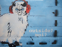
In this case the stuck up white cat, not only adds character and differs itself from other bags, but it more importantly builds the brand through creating an interesting and unique focal point, which in turn promotes the brand as it is eye catching, amusing and creative. A good way to build recognition and reflect the energy and passion of the 'White Stuff' brand.